Everyday Icon #1 The Chupa Chups lollipop
Another look at the overlooked
In many ways the Chupa Chups lollipop, invented in 1958, is a bona-fide design classic. The invention of Spanish businessman Enric Bernat, it was the first sweet on a stick that truly captured the imagination of children, thus liberating them (and their parents) from the tyranny of sticky fingers.
It was also the first sweet to be placed in a jar on the counter, directly in view of its principal consumers. Prior to this, sweets had been marketed to adults and kept on tall shelves - a universe away from an impulse buy. It even had a clever name, Chupa Chups, taken from the Spanish verb chupar, to suck.
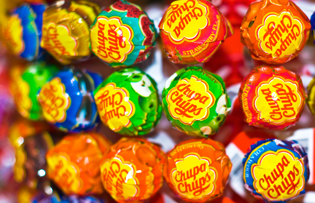
Realising though that however great a product is it’s nothing without a good logo to help brand it, Bernat called upon the services of an artist friend of his. Sitting at a pavement café with Bernat one day in 1969, Salvador Dalí, yes, the Salvador Dalí, scribbled away furiously on the pages of a discarded newspaper and, within an hour, had come up with the sweet’s famous daisy logo.

Acutely aware of presentation, Dalí insisted that his design be placed on top of the lolly, rather than the side, so that it could always be viewed intact. It’s proved to be one of the most enduring pieces of branding ever and one that’s still used today, four billion sales later. It’s quite literally your chance to own a Dalí for chump change.