American Airlines 'rebranded' online
But Anna Kövecses's new look for the troubled airline is not what it appears on initial viewing
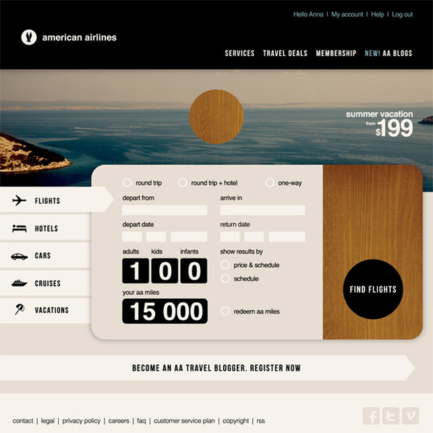
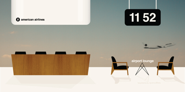
Cyprus-based designer Anna Kövecses has come up with a retro rebranding of the troubled American Airlines. The concept has won her $1,000 from the ad agency Victors & Spoils who pitched the rebrand competition to its worldwide bank of 6,000 creatives.
“My aim was to strip down the AA identity to the core and this meant building down the whole design to match this core as well,” Kövecses told fastcodesign. “I tried to look at the whole problem from a Dieter Rams-inspired point of view and find out what this company is about, what people expect from this company then visualise exactly that expectation, not less, not more.”
Muted colours, wood grain and extensive use of Helvetica give the rebranding a pleasingly populist mid-century modern aesthetic. However, the rebranding will not be taken up - it's another of those internet only redesigns, done for fun and which BuzzFeed recently called one of “the frenemies of the web" (And which, it pointed out, are often high on the helvetica and muted colours scale. . .)
There again, the last time Victors & Spoils did this kind of thing (for Harley Davidson) it ended up landing the job. Take a closer look at Kövecses' work. And for a taste of the REAL thing, take a look inside The Phaidon Archive of Graphic Design.