Paris buses get new Jean Francois Porchez signage
The French master of typography develops Parisine Girouette, a clear LED script for the capital's bus network
Jean Francois Porchez is a typographic legend in France, especially when it comes to transport systems. In 1996, the graphic designer - renowned for his work with the French newspaper Le Monde - updated the 1970s Univers-based font used by the Paris Métro. These characters became a bespoke collection called Parisine.
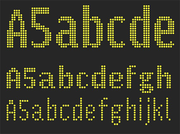
Now, a little over 16 years later, he's created a new version of Parisine for the capital's buses, specifically for their LED panel signs.
Graphically, these light-up signs pose particular challenges. The LED panels are pretty inflexible in what they can display, and some of the destinations have unfeasibly long names, which have to somehow be crammed onto the panels.
Small wonder, then, that Porchez's newly-created Parisine Girouette font - now in use on the network - took him more than a year to perfect.
The typographer says, "The letter-form design was the principle issue. We designed several versions, tested various weights and proportions until we found a solution that worked for everyone." He goes on "We proposed using static text, in a smaller size than necessary, as preferable to large-sized moving text. Non-static text moves too fast to be read comfortably, especially when the bus is in motion, too."
Sounds like a good solution to us. Read more about the story over at Creative Review. For further insight into the world of graphic design, consider our Graphic Design Archive, the ultimate reference guide for the design professional and enthusiast alike.