Pentagram gives Sotheby's a new look
The leading design studio reworks the branding for the legendary auction house
The dream job is often one that starts off small and just keeps on growing. But in those circumstances, designers know that it’s often about making your own luck. In 2011 Abbott Miller, partner at the world-class Pentagram design studio, was asked to rework the website for one of the world's oldest and biggest auction houses, Sotheby's. However, once he began work Miller soon realised that Sotheby's challenge lay beyond a simple site redesign. As Miller put it, "a broader review of all communications materials was needed".
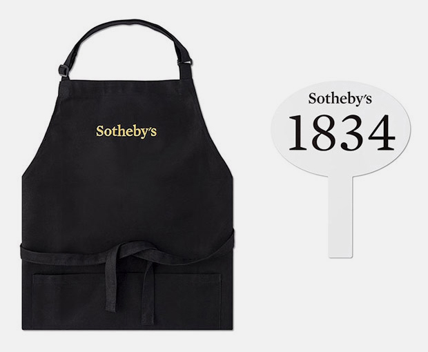
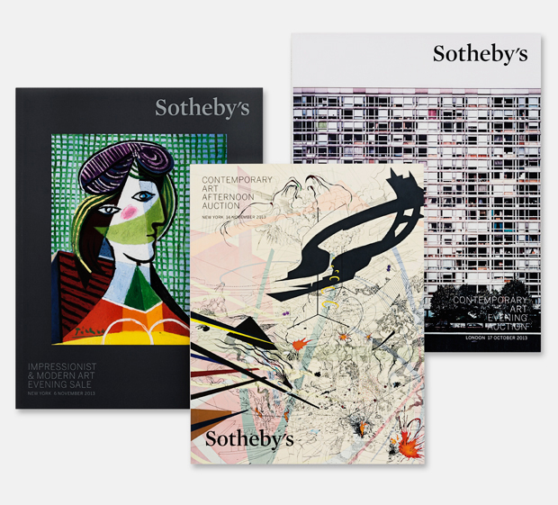
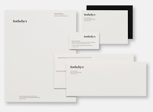
Over the last few years, Pentagram has redesigned everything from the logo, website and app to the stationery and related print collateral, auction catalogues, Sotheby's magazine, advertising and promotions, signage and environmental graphics, and even auction ephemera, such as aprons and bid paddles.
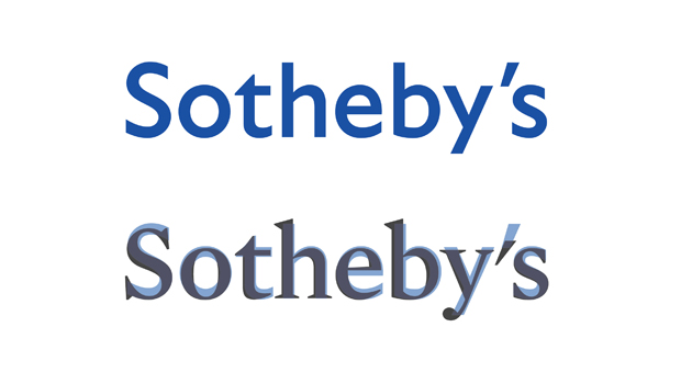
Like other big auction houses (including Bonham's and Phillips), Sotheby's had in recent times introduced a san serif logo, partly in an attempt to give the company a modern look.
"But what happened was they kind of severed their connection to this really historic lineage," explains Miller. "The font felt neutral and not very elegant, cold and disconnected, and didn't conjure the sense of the stature of the organization."
Miller's logo in the serif font Mercury is an attempt to be "more like how Sotheby's should've looked all along," he says, "We wanted a kind of 'click' moment, when suddenly Sotheby's just felt more like itself." That is a company with its roots in 1740's London, its HQ in New York, and salesrooms in Paris, Zurich, Milan, Geneva, Beijing, Hong Kong and Doha.
To complement the new logo, Miller commissioned the type designer Akira Kobayashi of Monotype to draw custom Chinese characters for Sotheby's Hong Kong wordmark. Quite an improvement, no?
{media4}
Find out more about this here, on Pentagram's own, beautifully produced site. For more on the firm itself, consider our brilliant Alan Fletcher books; Fletcher co-founded Pentagram in 1972 and was, for many years, Phaidon's much-loved Art Director.