US Postal Service gets a makeover
Biggest rebranding in history sees the Postal Service get an updated, simplified design in patriotic colours
Like other postal services around the world, the USPS had become much maligned and the victim of budget cuts. The graphic design agency, GrandArmy however, saw things differently. “We wanted to make people proud of the USPS,” says co-founder Eric Collins. “Politically it often seems like a target, or that we are constantly hearing about what is wrong with the USPS. Rarely do we ever stop to think about what an amazing technical marvel the entire institution is.”
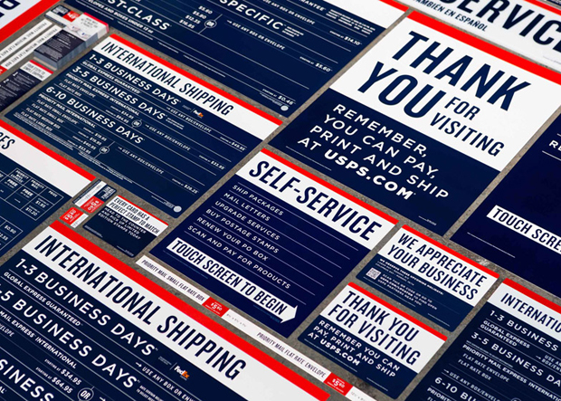
He acknowledges, though, that retail branch interiors had become “cluttered, disorganised and visually messy" over the years. So, rather than redesigning the interiors of each location, GrandArmy, which was established six years ago, decided that this would be a ‘paper and paint’ job.
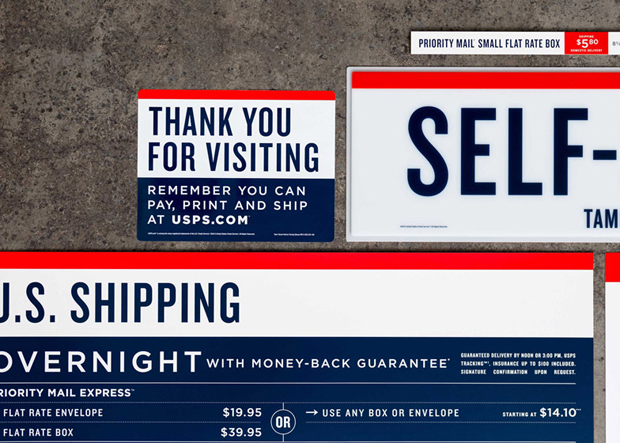
Collins, along with co-founders Larry Pipitone and Joey Ellis, were responsible for coming up with a unified system that would improve in-store signage, way-finding and that all-important packaging. The rebrand extends to posters, window dressing and a new mobile app.
The designers created a three-bar layout system in red, white and blue that is clear and modern while remaining referential to the brand’s past. “The USPS has a rich history that interweaves with the history of this country going back to its inception,” says Collins. “We wanted to nod to that heritage.”
The Postal Service’s text appears in two typefaces, Knockout for headers and Gotham for secondary headers and body copy. Both were the work of Hoefler & Co, the New York type foundry whose clients include President Barack Obama, Pentagram, The Guardian, Apple Computer and The Guggenheim Museum.
It's the kind of grand brand reimagining that brings two great Phaidon books to mind. The first, Michael Johnson's Problem Solved, is the only book that teaches students and professionals how to recognize the recurring problems common to all areas of communication including producing innovative work, avoiding repetition, standing out in the market place, reinventing a tired brand and using shock tactics. It's a cracking read and even if you're not in the business of rebranding yourself, will tell you all you need to know about how those that are go about it.
The Phaidon Archive of Graphic Design, meanwhile, features 500 graphic designs including newspapers, magazines, posters, advertisements, typefaces, logos, corporate design, record covers and moving graphics from around the world, which have all set a benchmark for excellence and innovation.