How Martin Parr's Phaidon book inspired Patrick Grant's new men's and women's collections
'Boring Postcards was the hub of a wheel of inspiration' says the E.Tautz and Norton & Sons head
UK TV viewers will know Patrick Grant from his appearances on the popular BBC show The Great British Sewing Bee. Men with an eye on high end style meanwhile, will admire him for his highly successful turnaround of the Saville Row tailor Norton & Sons and for launching the highly directional (and highly covetable) E. Tautz label in 2009 (for which he was made Menswear Designer of the Year at the British Fashion Awards the following year).
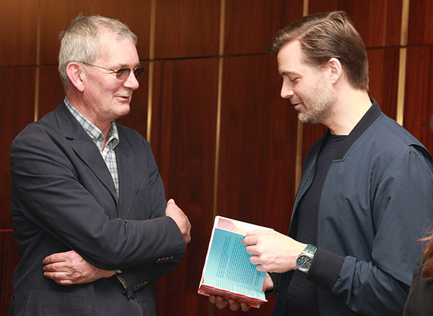
Patrick is a staple on the London fashion party scene and we've had many great chats with him over the years. So we were intrigued when he told us last week at the launch of Martin Parr’s latest book Real Food, at his E. Tautz store in Mayfair, that Martin's Boring Postcards (which you can take a look at here) inspired his latest collection. The day after the launch we caught up with him to ask him just what it was about Parr’s work that inspired him so. This is what he told us:
“I feel like he sees Britain in the way I see Britain. There’s an incredible empathy, a great understanding. There are all sorts of different ‘British-ness’: there’s the stiff upper lip, the pomp, the aristocratic, the noble ‘British-ness’. But there’s also a joyful celebration in the underbelly of Britain and I think that’s what Martin seems to find so fascinating. Plus he seems to have an incredible empathy with those subjects." Like many fans of Parr's work, Grant picked up on Martin Parr's legendary use of colour.
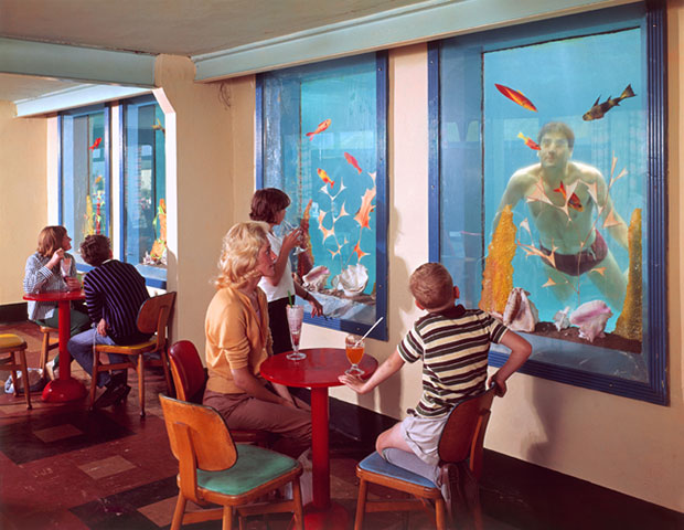
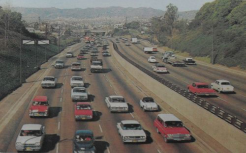
"I LOVE his use of colour. There are certain fashion photographers who have picked up on his heavily saturated, quite blown out style. You see it in quite a lot of fashion photography of the last decade. I love that stuff. I think it’s partly because we live in a country that a lot of the time is very dull. So through our tablecloths and our colourful pink iced buns and our hundreds and thousands and weird paraphernalia – flowery tabards being one example! - we inject opportunities for joy into the often grey landscape that we live in. I think Martin gets that absolutely and he also frames it beautifully. It’s all in the detail - I think while you could show his photographs to lots of people in lots of countries and they would like them, they are very particular to us Brits."
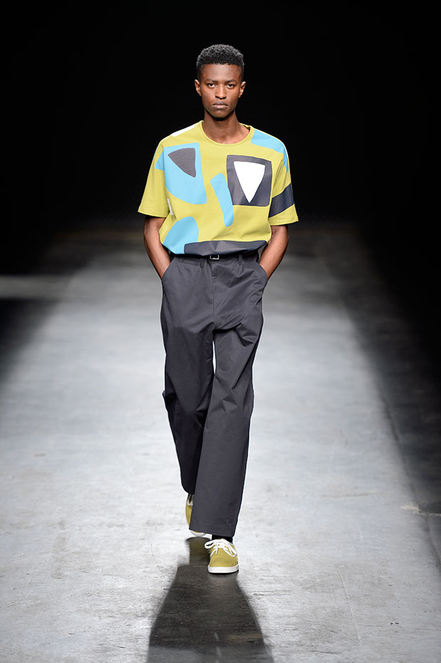
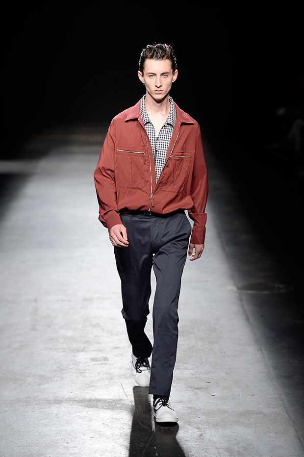
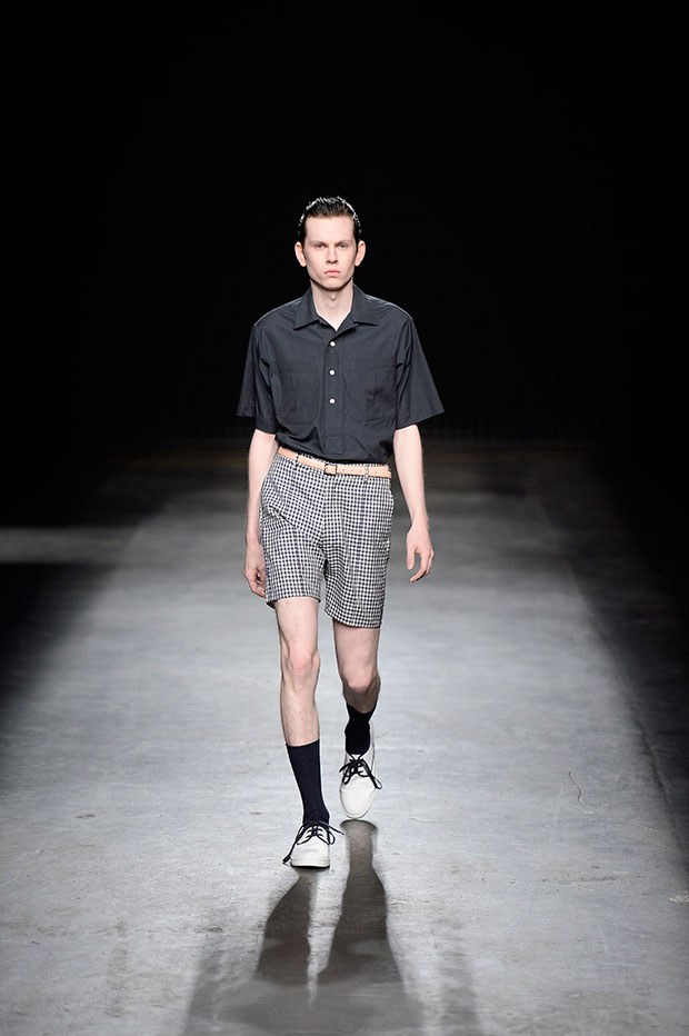
Grant's new E. Tautz collection features many of the desaturated colours and geometrical patterns you'll find in the photos in Boring Postcards. "The collection that is in store now, obviously has all sorts of references – a couple of different artists including Bruce McLean and John McLean. The idea behind it was based around how post war Britain embraced modernity and science as a means of creating better lives for everybody. And a lot of the postcards in Martin’s Boring Postcards were celebrating that era.
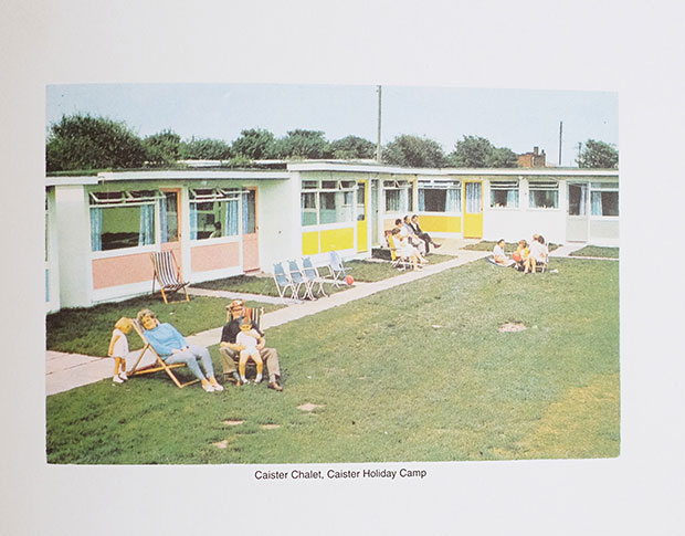
"People were proud – rightly - of bus stations and roundabouts, public buildings and holiday camps. The holiday camp for me seems to be this unifying thing - this sense of 'we’re going to find a new way, we’re going to holiday together, and we’re going to exercise together in these brilliant modernist steel pavilions'. And a lot of those holiday camps were architecturally very progressive. The technology in colour film was different all the colours were desaturated, and so the postcards in Boring Postcards were the sort of hub of a wheel of inspiration that included all sorts of other bits - but that was at the centre of it.
"Every collection we work on teds to start with some central kind of idea from which all the other stuff springs. I’ll find something: whether it’s a book of poetry or a play or a particular art exhibition. From that you begin a process of expanding on that idea and you make connections in your mind and bring things in and you then have to bring all that together and tell a story simply.
There were a couple of pictures that were very important. One was of holiday chalets painted different colours which again is a very British thing. It reminds you of the houses in Primrose Hill or Portree Harbour. And then there was another photograph of caravans that were all different colours again they were all laid out, they were scattered through the fields - we used that idea."
Check back next week when we'll bring you Grant's favourite photos from Real Food and some news about his latest project Community Clothing. For now though, buy Real Food here, Boring Postcards here and browse all our other books with Martin Parr here.