Facebook, Google, Pinterest logos given makeover
Istanbul-based agency Antrepo redesigns social networking sites taking inspiration from vintage cameras
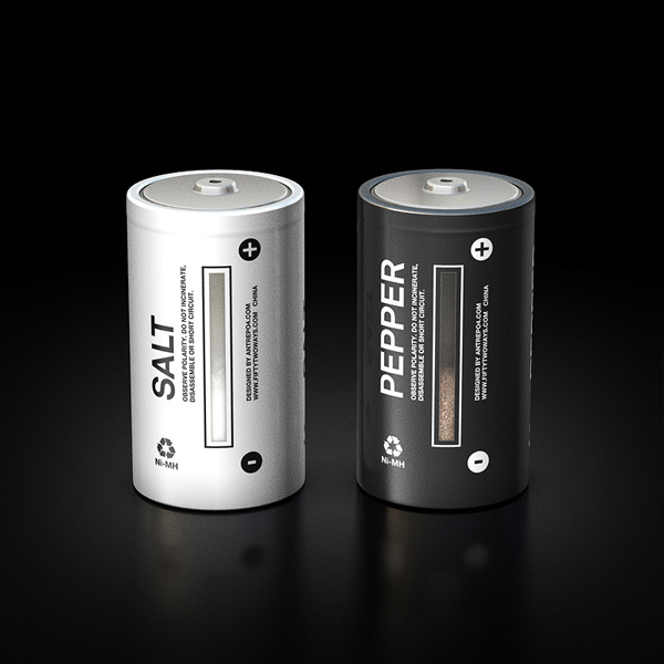
Antrepo finds new uses for old designs. The great Istanbul-based design consultancy has already produced salt and pepper shakers in the style of D-sized batteries, as well as a clock that looks like an old radio tuner.
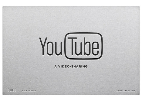
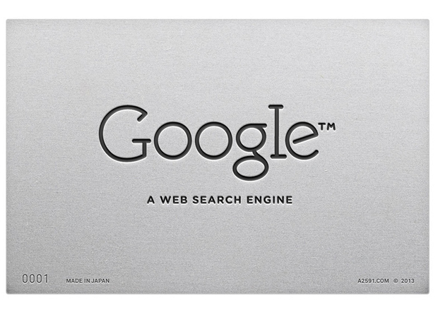
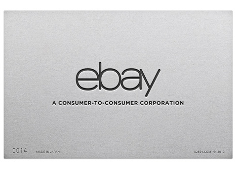
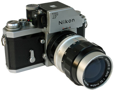
So, how would it update some of the best-loved new media brands? As co-founder Mehmet Gözetlik explained to Dezeen, it drew inspiration for the treatments of Facebook, Google, Ebay and Instagram's insignias from the brushed metal bodies of Japanese 35mm, single-lens reflex cameras from the 1970s and 80s.
While fewer and fewer people are using Canon's AE-1, Nikon's FTn, Ashai Pentax's ESII, and Minolta's XG-1, the cameras are still regarded as well-made examples of Japan's then-unbeatable (and well protected) production lines.
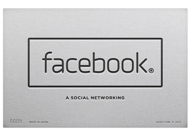
The logos are simple too. As also Gözetlik notes, the brands used a limited range of stylistic differences to distinguish themselves remarkably well. "We notice that almost all of these brands used the same style for their logos and typography," he explains, "line-based logos and extended-outline fonts."
Of course, none of these designs have been commissioned or adopted by the online heavyweights; nevertheless in an age when many brands are struggling with the heritage of a perky, vernacular graphic treatment - often commissioned at start-up stage - while assuming a dominant and perhaps sombre market position, Antrepo's logos certain seem to offer a clean and well-made solution. For more on the story, see Dezeen, and for other great visual treatments from days gone by, consider our wonderful Archive of Graphic Design.